Quiet authority.
Human warmth.
The brand guidelines for Deepti Agarwal, MD and The Healthspan Compass™. A shared reference for everyone bringing her work into the world.
Explore the guideScience with a human presence.
Precision medicine and regenerative therapeutics, expressed with clinical rigor and the warmth of a physician who sees the whole person.
The brand brings systems thinking to health: metabolism, hormones, inflammation, recovery, and regenerative capacity considered together. Its purpose is to support vitality, clarity, and resilience across decades.
Every touchpoint should feel thoughtful, calm, and personal. Give the reader room to reflect. Let clear thinking and real experience carry the authority.
“Health is not a luxury,
it is leverage.”A supporting brand line
Precise
Specific language. Considered detail. Respect for nuance.
Human
A physician’s perspective, grounded in lived experience.
Grounded
Muted natural color. Editorial restraint. Space to breathe.
A name that carries the identity.
Typography is the identity. Use the nameplate and framework wordmark consistently, with room around each to remain clear.
Include ™ on first or prominent use. Use the complete name in headlines; “the Compass” is reserved for body copy after the full name has appeared.
Purpose in Healthspan.
Capitalize Health and Healthspan. Keep Healthspan as one word; italicize only “span” when styling the tagline.
Give the name room
- Clear space on all sides: at least the cap-height of the nameplate.
- Minimum nameplate size: 14px for digital use; 10mm for print, as specified in the source guide.
- Use Cormorant Garamond for the nameplate and framework wordmark.
Keep the identity intact
- Do not stretch, compress, crowd the letter-spacing, or add effects.
- Do not introduce an illustrated logo mark or substitute a new typeface.
- Use the Healthspan tagline above; the earlier “purpose in longevity” wording is superseded.
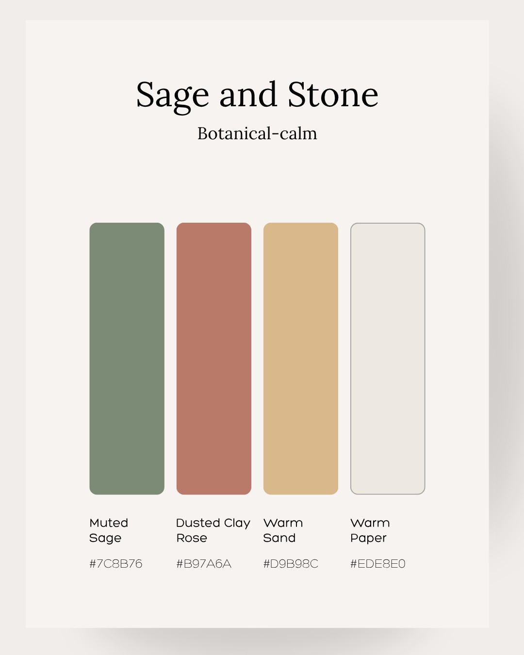
Sage and Stone.
The original four-color palette. Soft, grounded, and quietly confident, with warmth expressed through restrained accents.
Muted Sage
#7C8B76RGB 124, 139, 118Grounding fields, section markers, and quiet visual emphasis.
Dusted Clay Rose
#B97A6ARGB 185, 122, 106A measured touch of warmth in details and editorial highlights.
Warm Sand
#D9B98CRGB 217, 185, 140Soft emphasis, fine rules, and moments of warmth.
Warm Paper
#EDE8E0RGB 237, 232, 224The generous, open canvas that lets words and photography breathe.
Charcoal Ink #2A2420
Retained from the source guide for readable text. Use it for body copy on Warm Paper or Warm Sand. On sage and clay, reserve it for large headlines or place text on a light panel.
Clarity comes first.
Charcoal Ink on Warm PaperWorking with the palette
- Let Warm Paper and open space lead. Use sage for grounding, with clay and sand in smaller moments.
- Keep the palette muted and neutral in character. Create emphasis through scale and composition.
- Place small text on paper or sand for contrast. Avoid white body text on these mid-tone swatches.
A single current direction
- Sage and Stone replaces the earlier ivory-and-gold primary palette.
- Use the exact hex values shown here; the palette image is available below.
- Do not introduce neon, generic clinical blue, or additional saturated accent colors.
Warmth in the headline. Clarity in the detail.
Cormorant Garamond brings expression and gravity. Inter keeps every functional element direct and legible.
Cormorant Garamond
Headlines, nameplate, framework wordmark, and pull quotes.
Light 300 · Medium 500 · Semibold 600Inter
Body copy, labels, navigation, captions, and buttons.
Regular 400 · Semibold 600Precision Medicine for Optimal Healthspan
The Healthspan Compass™
Metabolic & Hormonal Regulation
“Health is not a luxury, it is leverage.”
Consider metabolism, hormones, inflammation, recovery, and regenerative capacity together.
Explore the framework →
Reference sizes from the source guide. Adapt display sizes to the format while keeping body copy legible and hierarchy consistent.
Four domains. One whole person.
Keep these domain names intact, in this order, whenever presenting The Healthspan Compass™.
Metabolic & Hormonal Regulation
Energy production, inflammation, stress adaptation, and metabolic timing.
Signal & Activation
Circadian rhythm, hormonal signaling, and nervous system readiness.
Structure & Load
Strength, mobility, joint integrity, and pain resilience.
Recovery & Repair
Sleep architecture, nervous system regulation, immune resolution, and tissue healing.
Use names and numbers to distinguish domains. The domain-specific color assignments in the August PDF belong to the earlier palette and are not prescribed by this updated guide.
Rigor underneath. Warmth on the surface.
Write like a physician who thinks and writes like an essayist: specific, personal, and comfortable with nuance.
Let the voice feel human
- Write in first person when speaking as Dr. Agarwal.
- Lead with lived detail, an observation, or a thoughtful question.
- Let the evidence support the story without burying the reader in jargon.
- Leave space for uncertainty, complexity, and reflection.
Protect the tone
- Avoid tip-first openings, listicle hooks, and generic wellness language.
- Avoid hashtag blocks, biohacker language, and corporate phrasing.
- Never promise guaranteed outcomes, miracle results, or certainty the evidence cannot support.
- Keep clinical authority calm and accessible.
“Rather than asking whether something is broken, the Compass asks whether the body is oriented in the right direction.”
“Health is not a luxury, it is leverage” remains a supporting line for bios and appropriate longer copy. The primary tagline is “Precision in Health. Purpose in Healthspan.”
Editorial. Warm. Real.
Show the person behind the work. Real photography, thoughtful composition, and generous negative space give the brand its human presence.

Photography leads
- Use real photographs of Dr. Agarwal, with candid moments preferred over staged poses.
- Keep the composition clean, elegant, and spacious.
- Avoid generic stock doctors or anonymous healthcare imagery.
Illustration has a focused role
- Reserve illustration for explanatory infographics and social content.
- Do not use illustration or generated likenesses to depict Dr. Agarwal without specific approval.
- Avoid crowded layouts, decorative clutter, and generic healthcare treatments.
One language, wherever it appears.
Layout examples applying the current palette, identity, and tagline across print and digital materials.
Purpose in Healthspan.
Keep the reference close.
Use this page for the current palette and tagline. The original materials are preserved below with their version context.